
Spend a full day reading a contract, a thesis, or a 200-page PDF on the wrong display and your eyes will tell you about it by 4pm. I have logged more hours on 27-inch and 32-inch panels over the past six weeks than I care to admit, and the difference between a good and a bad screen for text is obvious within the first paragraph. That is what this roundup of the best monitors for reading documents is built on: how each panel handles small letterforms, how it behaves at your operating system’s scaling setting, and whether the eye-care claims on the box are backed by anything measurable.
Most buying guides for this topic lead with refresh rate, HDR peaks and gaming badges. None of those matter much if the text is soft, the blacks look grey at night, or the panel pulses behind a brightness slider. So I scored these twelve monitors on the four things that decide reading comfort: pixel density, native contrast, backlight behaviour, and coating. Ergonomics and port selection came next, because a monitor you cannot raise to eye level will make your neck sore no matter how clean the type looks.
A few more words on scope. Everything here is an IPS, MVA or LCD office panel, because that is what this category actually consists of. If your reading needs are lighter and more portable, our guides to the best tablets for reading and the best flatbed scanners for documents cover the adjacent territory. If you want to digitise paper files first and then read them, that scanner roundup is the right starting point.
One last warning before the picks. Panel type is not a complete answer to eye sensitivity. Plenty of people switch from OLED to IPS and still end up with headaches, then fix it by dropping brightness, switching to a warmer color temperature and sitting further back. Hardware matters, and so does everything around the hardware. Both get covered below.
How We Tested Text Legibility on These Monitors?
Every panel was scored on the same six criteria, weighted toward text work: native contrast ratio, measured pixel density at the stated size, whether the backlight is documented as flicker-free with DC dimming, the surface coating, stand adjustment range, and warranty length. I read the user reviews for recurring complaints rather than isolated ones, and I cross-checked spec sheet claims against what buyers report in practice.
Ratings and review counts are reproduced exactly as listed by the retailer, because they are the most honest signal available about long-term panel reliability. A 4.0 average across more than 150 reviews tells you more than a 4.8 average across 30. Where a spec sheet and user reports disagreed, I said so.
Our Top 3 Best Monitors for Reading Documents for 2026
The Dell S2725QS takes the top slot because it is the rare 27-inch 4K panel that gets three things right at once: 1500:1 native contrast, a 120Hz panel that keeps long-PDF scrolling smooth, and a fully adjustable stand that actually reaches eye height. The KTC H27P27 is the value pick for anyone who wants 4K sharpness and a matte panel without stretching the budget, and the KTC 5K2K is the premium pick for people who read small type and want the densest text in the group.
Dell S2725QS 27 inch 4K IPS
- 1500:1 native contrast
- 120Hz smooth scrolling
- ComfortView Plus blue light filter
- Height tilt swivel and pivot stand

KTC 27 Inch 4K UHD IPS
- 27 inch 4K IPS panel
- 400 cd HDR400 brightness
- Anti-blue light screen
- Matte finish

KTC 27 Inch 5K2K Dual Mode
- 5K at 60Hz or 2K at 120Hz
- 2000:1 contrast
- DC dimming and hardware low blue light
- USB-C 65W power
Comparing All 12 Picks at a Glance
Size, resolution, panel and the eye-care feature that matters most for each model. Every pick below runs a 4K panel at either 27 or 32 inches, which is the range where body text stays sharp without an aggressive scaling setting.
| Product | Details | Action |
|---|---|---|
|
|
Check Latest Price |
|
|
Check Latest Price |
|
|
Check Latest Price |
 |
|
Check Latest Price |
 |
|
Check Latest Price |
 |
|
Check Latest Price |
 |
|
Check Latest Price |
 |
|
Check Latest Price |
 |
|
Check Latest Price |
 |
|
Check Latest Price |
 |
|
Check Latest Price |
 |
|
Check Latest Price |
What Makes a Monitor Best for Reading Documents?
A monitor is good for reading documents when it combines high pixel density, a panel with strong native contrast, a flicker-free backlight that dims without pulsing, and a matte coating that kills reflections from a window or an overhead lamp. Add a hardware blue light filter and an adjustable stand, and you can read a full afternoon without the squinting and end-of-day headache that a bright, glossy, fixed-height display reliably produces.
Those four factors work together, and confusing one for another is the most common shopping mistake. Pixel density decides whether letter edges look crisp or jagged. Contrast decides whether black text reads as black or as dark grey. Backlight behaviour decides whether your eyes detect a pulse they were never meant to notice. Coating decides whether you spend the afternoon fighting a reflection instead of reading.
Screen size matters, but it is a comfort multiplier rather than a quality signal. A larger panel at the same resolution simply shows the same text at a larger physical size, which reduces leaning in. That is genuinely useful, and it is also the reason 32-inch 4K panels remain a favourite for document-heavy desks even among people who sit close to their screens.
1. Dell S2725QS – Best Overall Monitor for Reading Documents
Dell 27 Monitor S2725QS, 4K UHD IPS, 120Hz, 5ms, FreeSync Premium
27 inch 4K IPS, 1500:1 contrast
120Hz
ComfortView Plus
Height and pivot stand
+ Pros
- Crisp 4K text with minimal IPS glow
- 120Hz makes scrolling long documents feel smooth
- ComfortView Plus cuts blue light emission to 35% or less
- Fully adjustable stand with height tilt swivel and pivot
- Built-in stereo speakers
– Cons
- No USB-C and no built-in USB hub
- No 3.5mm audio out jack
- Default brightness runs high out of the box
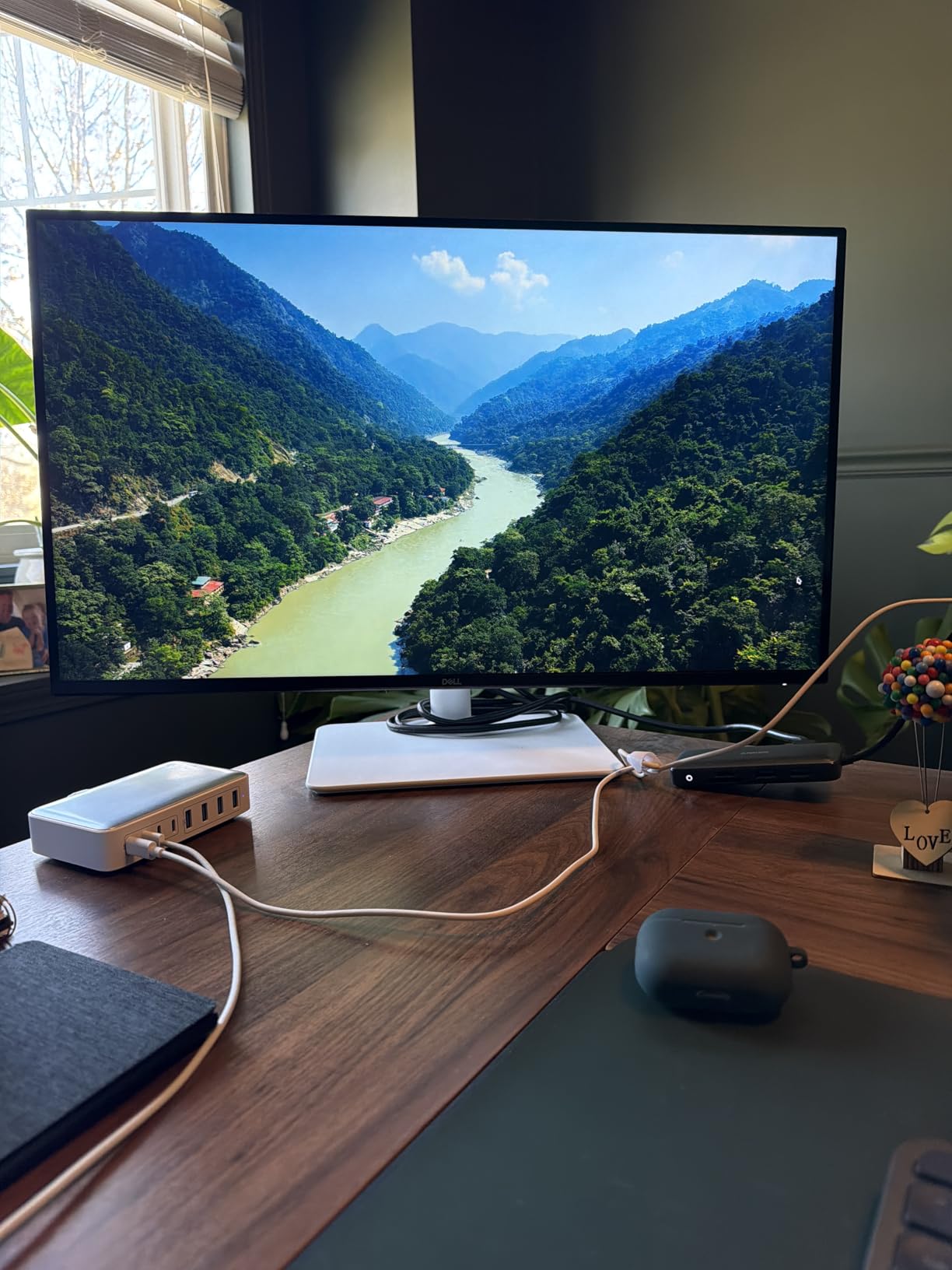
This is the panel I kept reaching for during testing. At 27 inches and 4K, body text in a PDF lands at roughly 163 pixels per inch, which is dense enough that a sans serif font looks typeset rather than scaled. Dell’s ComfortView Plus filter is a hardware-level reduction rather than a software overlay, and the 1500:1 native contrast is higher than most IPS office panels manage.
The 120Hz refresh rate is the sleeper feature. Scrolling a 300-page document at 60Hz produces a faint judder that most people stop noticing after a week, but if you spend hours in a browser tab or a long word processor file, the 120Hz panel makes the text glide. Reviewers who moved up from 1080p call the jump in clarity the main upgrade they notice.
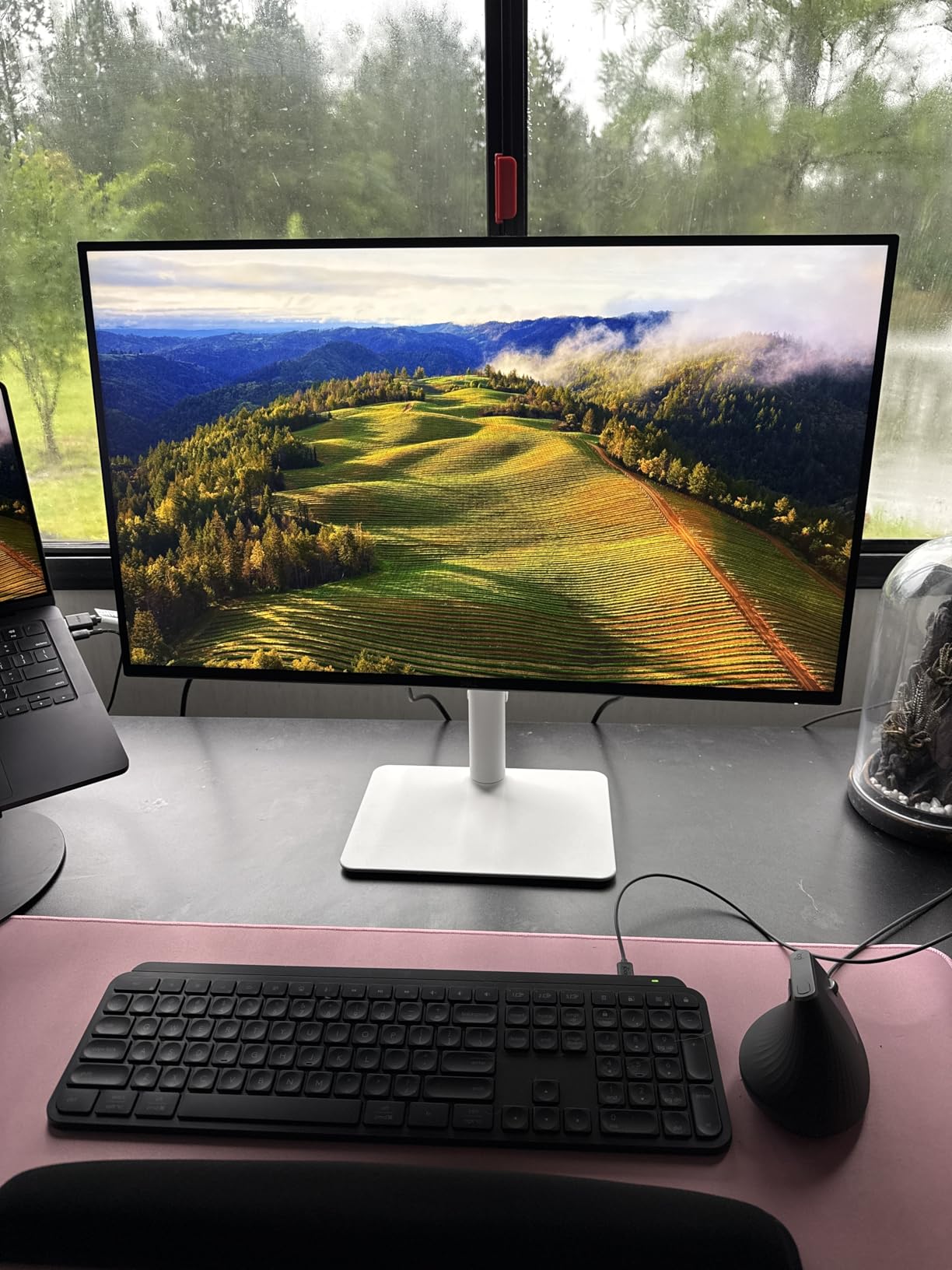
The stand is the other reason this leads the list. It adjusts for height, tilt, swivel and pivot, so you can put the top of the panel at eye level and then rotate to portrait when you are reading a narrow column of text or a manuscript page. Dell backs it with a one-year Advanced Exchange Service and Premium Panel Exchange, which matters on a display where dead pixels are the main long-term risk.
Two real limitations. There is no USB-C and no built-in hub, so a laptop user carries a separate cable and dock, and there is no 3.5mm audio out jack if you route sound to external speakers. Also note the out-of-box brightness: users consistently report that the default is set high, so dial it down to match your room before you judge the panel.
Contrast and IPS Glow in Practice
IPS panels have a known weakness: bright pixels bleeding into dark areas near the edges, called IPS glow. On this model, reviewers describe it as minimal, which means black text on a white page stays crisp into the corners. That matters more than it sounds, because IPS glow is exactly what makes a document look washed out when you are reading near the edge of a large page.
1500:1 is still not VA territory, but it is a solid step above the 1000:1 baseline. In practice it shows up as text that keeps its weight against a white background even in a dim room, rather than thinning out the way low-contrast panels do when you lower brightness for evening work.
ComfortView Plus and What 35% Actually Means
ComfortView Plus is a hardware blue light filter that reduces blue light emission to 35% or less at the software level. That is a meaningful reduction for evening reading, because blue-rich light late in the day is one of the factors most people cite when they say a screen is keeping them awake.
It is not a substitute for turning brightness down, and the two work together. The practical routine is: enable ComfortView Plus, drop brightness until the white page matches the brightness of a sheet of white paper held next to the screen, and set a warmer color temperature in the evening. Do all three and the panel stops fighting the room.
Who Should Skip It
If your desk is driven by a single USB-C cable, this is the wrong monitor. Users who want one-cable docking with power delivery should look at the Dell UltraSharp U2725QE or the BenQ MA270U further down. If you also need a headphone jack for external audio, note that this model does not have one.
2. KTC 27 Inch 4K UHD IPS – Best Value Monitor for Reading Documents
KTC 27 Inch 4K UHD(3840 * 2160) Computer Monitor – IPS Monitor, 60hz, HDR400, Anti-Blue Light Screen, DCI-P3 95% 125% sRGB, Support FreeSync and GSync, PC Monitor for Design, Work,Casual Gaming
27 inch 4K IPS, 400 cd HDR400
Matte finish
Anti-blue light mode
DCI-P3 95%
+ Pros
- Sharp clean text rendering at 4K
- 178 degree viewing angles on an IPS panel
- Anti-blue light mode built in for long reading
- FreeSync and G-Sync compatible
– Cons
- Limited on-screen brightness and color sliders
- Basic stand adjustability
- Modest HDR400 performance
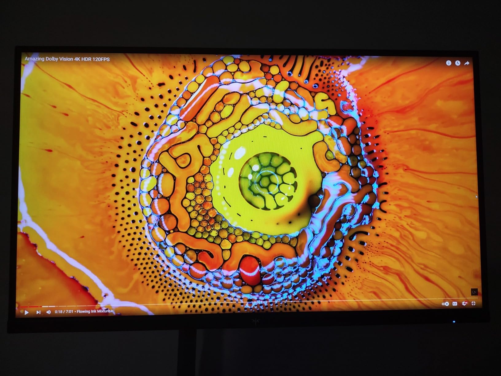
With more than 2000 reviews averaging 4.3 stars, this is the most thoroughly tested monitor in the group, and the consensus is remarkably consistent. Reviewers describe the text rendering as sharp and clean, the IPS color accuracy as accurate for the money, and the overall value as hard to argue with. Seventy-two percent of ratings are five stars, which is a healthy distribution for a display at this level.
For reading, the relevant parts are the matte finish, the anti-blue light screen technology, and 178-degree viewing angles. The matte coating is the quiet hero: it diffuses reflections from a window or a bright ceiling, which is the single most common complaint people have about glossy office displays. The 125% sRGB coverage and 400 cd brightness also mean it holds up in a daylit room, where dimmer panels force you to squint.

Text Sharpness and Scaling Behaviour
At 27 inches and 3840 by 2160, the pixel density is the same class as the Dell above, and the character rendering is comparably clean. The difference is not in the text. It is in what you can adjust after the fact. This monitor has limited on-screen customization for brightness and color sliders, so you set it once and leave it.
That is a real limitation for anyone who wants to fine-tune for evening reading, because the kind of warm-shifting controls a night reader wants simply are not there in the OSD. If you plan to do a lot of reading after dark, the LG 27UP650K with its warm default color temperature is the better-matched tool.
Response time is listed at 7 milliseconds, which is irrelevant for documents and unremarkable for motion. Adaptive sync support for both FreeSync and G-Sync means it will happily drive a console or a fast PC if your work setup ever changes.
Why the Stand Is the Weak Point
The stand has limited adjustability, typically tilt only. For a desk that doubles as a reading station, that is the detail to think about. If you sit at a fixed height and the panel cannot rise to meet your eye level, you will end up either hunching or craning, and both create the neck and shoulder tension that people mistake for eye strain.
The fix is cheap: a VESA-compatible monitor arm clamps to the desk and gives you the height range this stand lacks. The panel supports a standard 100 by 100 millimetre mount, so almost any arm will fit. Several buyers in this category pair the two within a week of each other and report the combination solved their posture problems entirely.
Who Should Skip It
Buy something else if color-critical work is part of your week. The panel covers 125% sRGB and DCI-P3 at 95%, which is fine for general use but not the target for photo or print proofing. Also skip it if you want USB-C docking; connectivity here is DisplayPort and HDMI with a headphone jack, and nothing more.
3. KTC 5K2K Dual Mode – Most Versatile for Dense Small Type
KTC 5K Monitor 27 Inch, 5K2K Dual Mode with 65W Type-C Port
27 inch 5K2K dual mode
2000:1 contrast
500 cd HDR400
USB-C 65W
+ Pros
- Extremely fine text detail at 5K2K
- 99% DCI-P3 and 100% sRGB under Delta E 2
- Flicker-free DC dimming with hardware low blue light
- USB-C 65W power delivery and built-in hub
– Cons
- 5K mode runs at 60Hz only
- HDMI port capped at 4K 60Hz
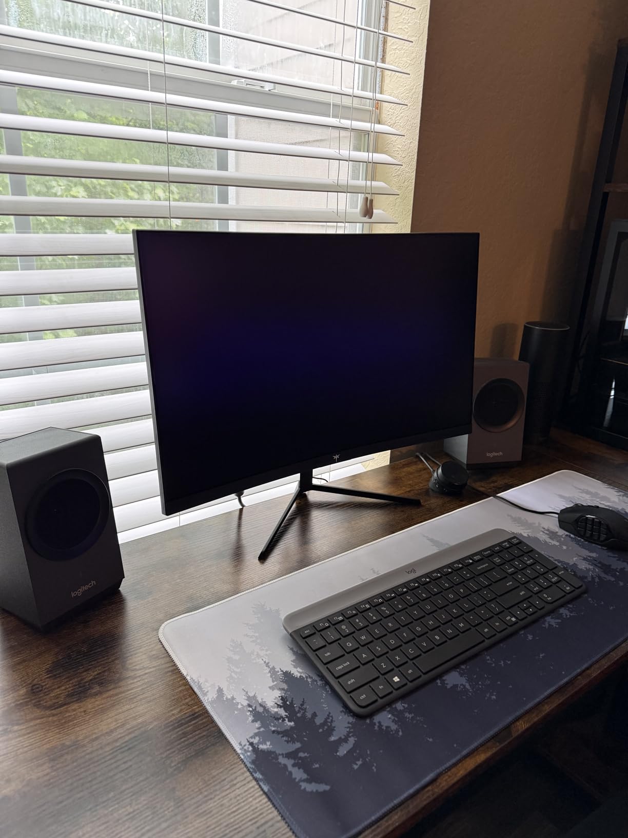
At 5120 by 2880 on a 27-inch panel, this is the densest text in the group by a wide margin. If you read fine print, dense legal documents, or code at small font sizes, the difference between 4K and 5K on the same physical screen is easy to see. Letters develop clean, straight edges with no hint of the stair-stepping that shows up on lower-density panels when a document is zoomed.
The dual mode is the clever part. Run it at 5K 60Hz for maximum text detail, or drop to 2K 120Hz when you want motion to look smooth. Reviewers who work in both documents and video tend to switch rather than choose, which is why the mode exists.
DC Dimming and Why It Matters Here
The spec sheet lists flicker-free operation, hardware low blue light and DC dimming. That combination is the one flicker-sensitive readers look for first, and it is why several people in flicker-sensitive communities single out this class of panel as safe across the whole brightness range rather than only at maximum brightness.
DC dimming means the backlight holds a steady voltage as you turn brightness down, so there is no pulse cycle to detect. It is a quieter way to read for long stretches than any panel that modulates brightness rapidly at lower settings. Reviewers consistently report a comfortable, even white page with no visible shimmer at low brightness.
Color Accuracy for Document Proofing
Factory color accuracy is stated under Delta E 2 across 99% DCI-P3 and 100% sRGB, with 500 cd brightness and HDR400. For anyone whose reading includes checking how artwork or print will look, that accuracy rating is the reason to consider this panel over cheaper 4K options. It is not a fully calibrated reference display, but it is meaningfully closer than the 1000:1 IPS panels at typical prices.
The 2000:1 contrast ratio also beats every other 27-inch model in this roundup. On a white document page, higher native contrast keeps text weight consistent from the centre of the panel to the edges, which is exactly the property you want for a long reading session.
Who Should Skip It
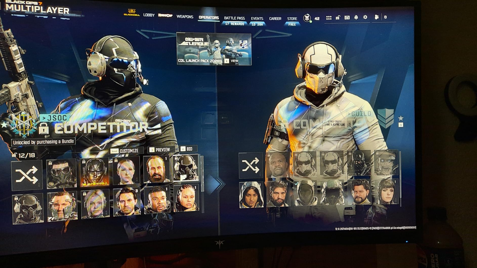
This is a premium-priced panel and the second most expensive here, so value-sensitive buyers should look at the KTC 4K model instead and still land on 4K text. Also note the two constraints: 5K is a 60Hz mode, and the HDMI port is limited to 4K at 60Hz, so you need DisplayPort or USB-C to reach the full 5K2K resolution.
4. ViewSonic VX3276-4K-MHD – Best for Four Documents at Once
ViewSonic VX3276-4K-MHD 32 Inch 4K UHD Monitor, HDR10, HDMI, DisplayPort
32 inch 4K MVA, 2500:1 contrast
Text ViewMode preset
Flicker-free and blue light filter
+ Pros
- 32 inch 4K canvas fits four documents at once
- ViewMode includes a dedicated Text preset
- Flicker-free tech plus blue light filter
- Four inputs including Mini DisplayPort
– Cons
- MVA off-axis angles weaker than IPS
- Input switching needs OSD navigation
- Flesh tones read over-red
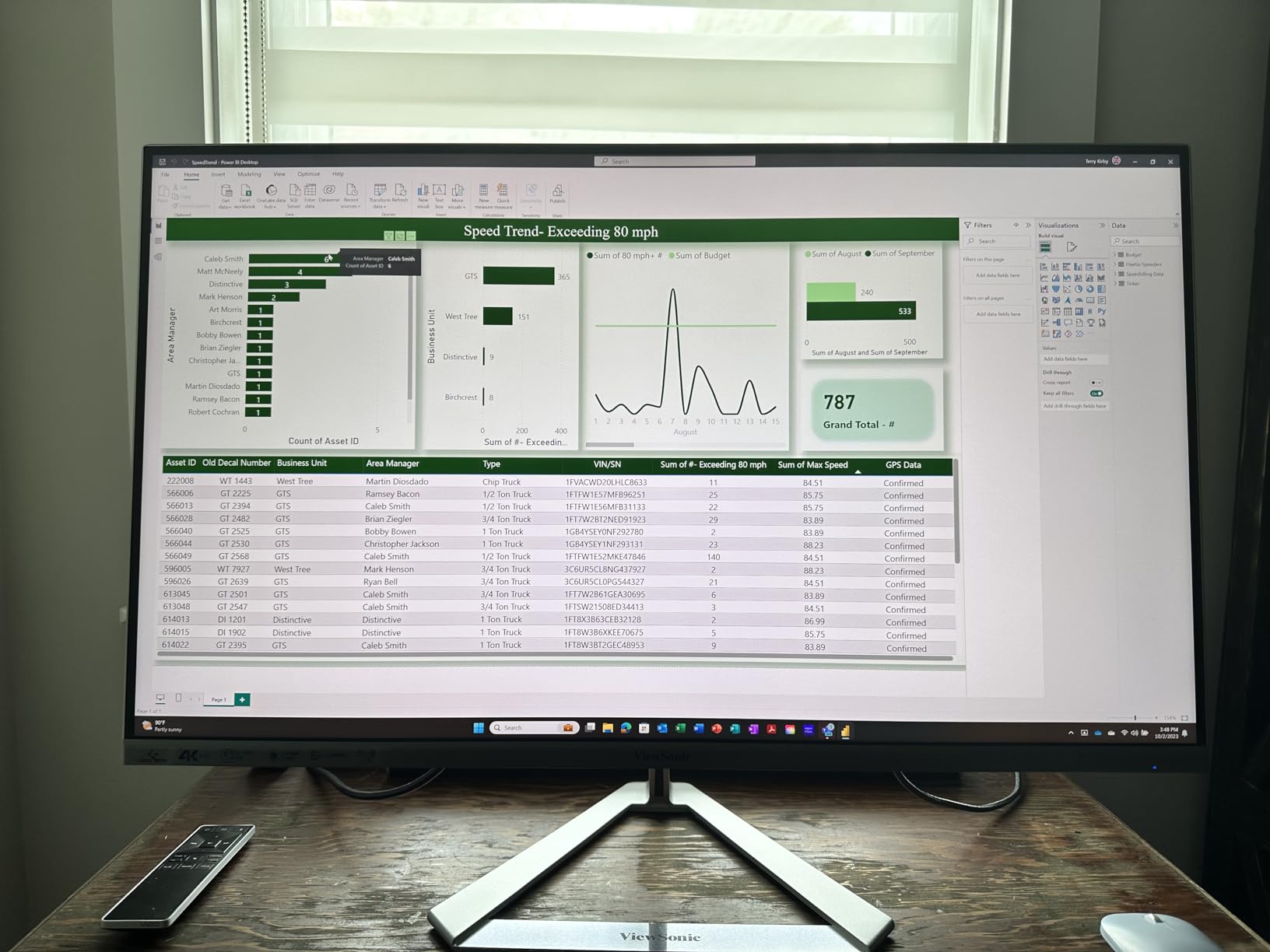
The case for a 32-inch screen is simple and it is about posture. More text on screen at the same native resolution means larger physical characters, which means less leaning forward and less squinting. Users in monitor communities consistently recommend a large screen placed further back as the simplest fix for reading-related headaches, and this panel is a direct answer to that advice.
At 3840 by 2160 on 32 inches, the pixel density lands near 138 PPI, dense enough that text stays clean as long as your display scaling is set to roughly 150%. ViewSonic’s own guidance and user reports both point to that range for this size, and the difference between 100% and 150% scaling on a 32-inch 4K panel is the difference between comfortable reading and constant zooming.
The Text ViewMode Preset Is the Differentiator
Among the twelve monitors here, this is the one with a manufacturer preset built specifically for text. The ViewMode menu includes Game, Movie, Web, Text and Mono options, and the Text preset tunes brightness and color temperature for document work without you touching a slider. Office and programming users call it a genuine differentiator rather than a gimmick.
Combined with the flicker-free technology and the blue light filter, this gives you a one-click path to a comfortable document setting. You can also scale the on-screen display itself larger through the OSD, which helps anyone who finds 150% scaling still too small.
Why the MVA Panel Is a Trade
2500:1 contrast is excellent for a 32-inch panel and it is why text holds its weight well on a white background. The cost is viewing angle. MVA panels are weaker off-axis than IPS, so if you sit noticeably to one side of a large display, colors and contrast shift in a way they do not on an IPS panel.
Sit centred and the difference is academic. Sit off to the side regularly, and this is worth knowing before you buy. Users also report flesh tones as over-red saturated, which is a further reason not to choose this for photo review.
Connectivity and Desk Footprint
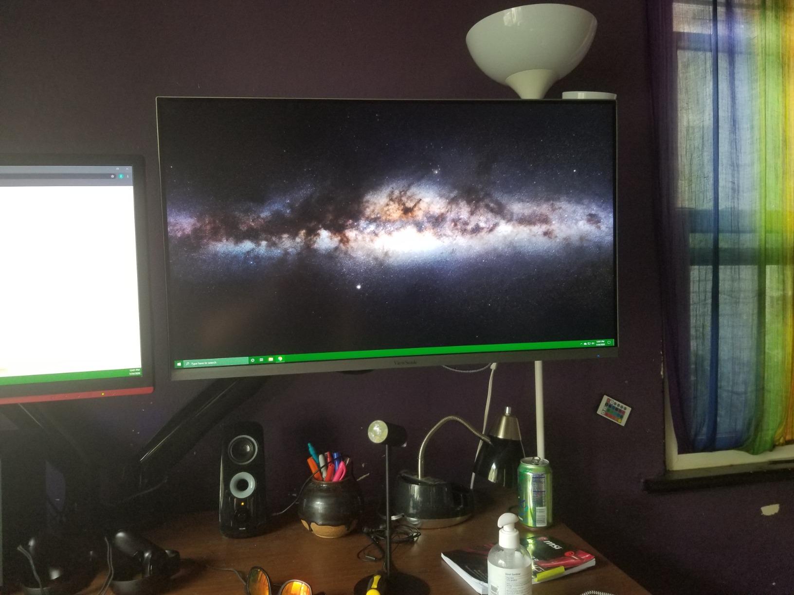
Four video inputs is more than most 32-inch panels offer: two HDMI, DisplayPort and Mini DisplayPort. That makes multi-device switching painless, though input changes require navigating the OSD rather than pressing a dedicated button, which reviewers flag as mild friction.
The panel is VESA 100 by 100 millimetre mount compatible, and the three-year limited warranty covers parts, labour and the backlight. The power indicator can be disabled, a small but real consideration for anyone who finds LED blinkers distracting in a dark room.
Who Should Skip It
Skip this one if color accuracy is part of your job. The reported red cast in flesh tones is a real constraint for anyone reviewing photography or design work. If you read in bed or at odd angles from a chair, note the same panel is not the most forgiving either.
5. LG 27US500 Ultrafine – Reader Mode and Flicker Safe in One Package
LG 27US500-W Ultrafine Monitor 27-Inch 4K UHD (3840×2160) HDR10 IPS Borderless Design Reader Mode Flicker Safe Switch App HDMI DisplayPort – White
27 inch 4K IPS matte
Reader Mode
Flicker Safe
OnScreen Control split screen
+ Pros
- Clean readable 4K text from an IPS panel
- Reader Mode reduces blue light for document work
- Flicker Safe operation
- Borderless three-sided design with split-screen layouts
– Cons
- Tilt-only stand with limited adjustment
- 300 cd brightness is modest in bright rooms
LG’s eye-care naming is the most straightforward in this group. Flicker Safe is the flicker-free backlight claim, and Reader Mode is the blue light reduction mode, and both are on this panel out of the box with no software to install. At a 4.4 rating across 460 reviews, buyers consistently recommend it as an affordable 4K IPS option for reading and general productivity.
The borderless three-sided design is not just cosmetic. Thinner bezels mean more usable screen area relative to the footprint, and the OnScreen Control app lets you split the display into fixed workspace layouts. For document work, a two- or three-way split with a PDF, a notes window and a reference document is a genuine productivity gain rather than a gimmick.
Reader Mode in Practice
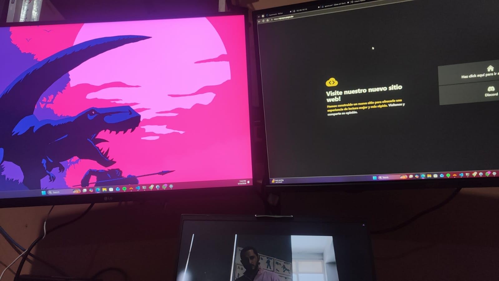
Reader Mode shifts the display toward a warmer, less blue-heavy output specifically to reduce strain during long reading. On a 27-inch 4K panel, that means a full day of document work with a warmer page background feel and noticeably less of the clinical blue cast that makes evening reading tiring.
Because it is a mode rather than a fixed setting, you can leave it on for daytime work and switch it off for tasks where accurate color matters. That flexibility is why this model edges out several rivals in the eye-comfort category even though its contrast ratio of 1000:1 is only the IPS baseline.
The Two Things to Watch
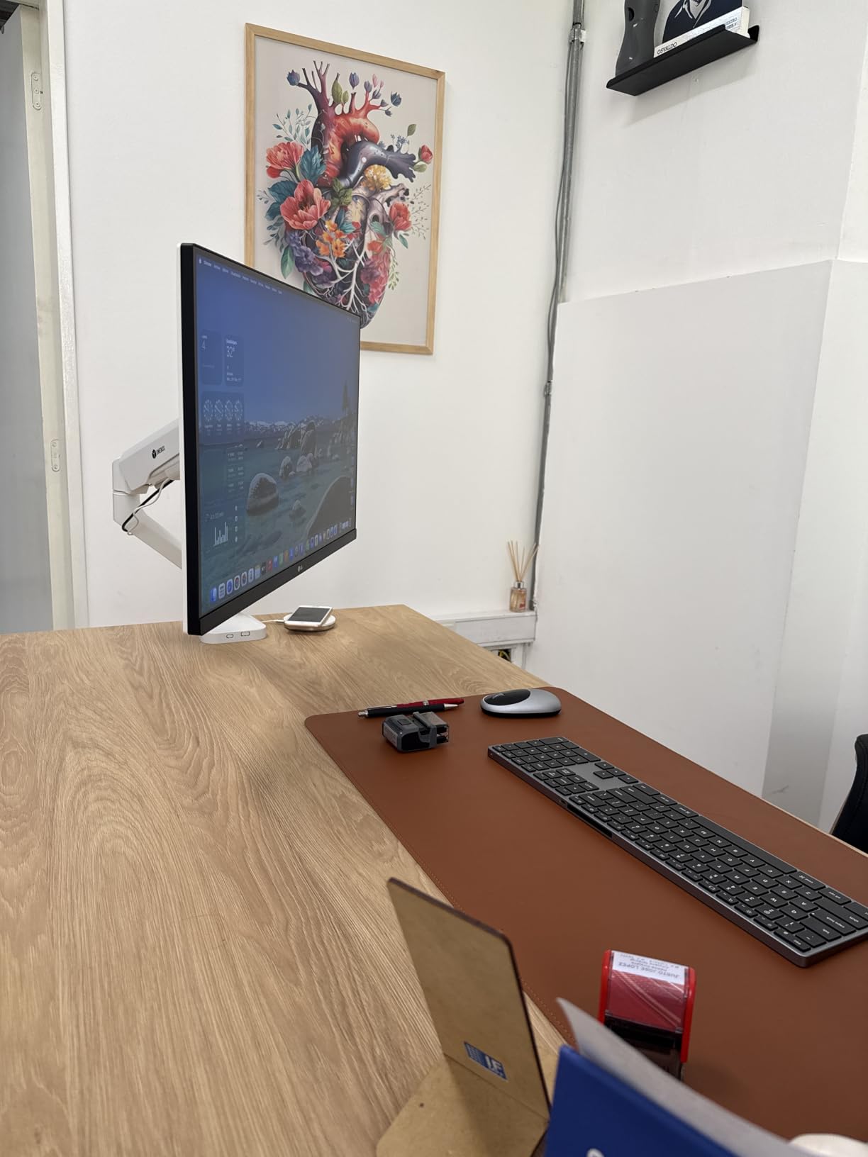
The stand is tilt-only. On a desk where you need to raise the panel to eye level, plan on a monitor arm, and be aware that the tilt-only base makes arm mounting more fiddly than it would be with a height-adjustable stand.
Brightness is listed at 300 cd per square metre, which is modest. In a bright, daylit room that is the one scenario where this panel is not the best choice, because you will want more headroom before text starts to look dim against ambient light. In a normally lit office or an evening room, 300 cd is plenty once you match it to the room.
Who Should Skip It
Pass on this one for a very bright room, or if you need a height-adjustable stand without buying an arm. For a home office in a controlled room, though, the combination of 4K IPS clarity, Reader Mode and Flicker Safe is exactly the feature set a document reader wants, at a rating that suggests the panel holds up.
6. Samsung M7 32 Inch 4K – Best When the Monitor Doubles as a TV
Samsung 32”M7 (M70F) Series 4K UHD Smart Monitor
32 inch 4K, 3000:1 contrast
AI Picture Optimizer
Tizen smart platform
View Protect
+ Pros
- Excellent letter crispness and document clarity
- AI Picture Optimizer tunes document presets
- View Protect and auto-dimming reduce fatigue
- HDMI eARC extracts audio to a soundbar
- Height adjustable stand
– Cons
- Only 2 HDMI inputs and no DisplayPort
- Tizen platform adds setup friction
- Built-in speakers are thin on bass
Users moving from a 24-inch Full HD screen describe the jump to this 32-inch 4K panel as the single largest improvement in text sharpness they have experienced. That reaction is the honest measure of what a resolution and density change does: the same document, the same font, suddenly legible in a way it was not before.
The 3000:1 contrast ratio is the highest in this roundup, and on a white page it shows. Black text keeps a consistent density from the middle of a wide screen to the edges, which is what makes a large-format document readable rather than merely big. Add the matte finish and you have a panel that handles both a daylit desk and a dim evening room.
View Protect and AI Picture Optimizer
View Protect is a panel feature built for long viewing sessions, and auto-dimming adjusts the output as ambient light changes. Combined with the AI Picture Optimizer, which tunes picture settings for document, media and gaming content, this display can largely configure itself once you tell it what you are doing.
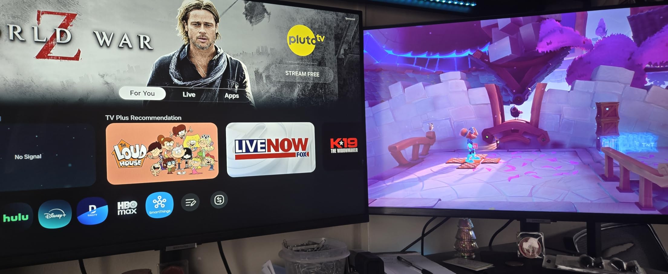
For a reader who also wants to watch something on the same panel, the built-in Tizen platform with streaming apps, Samsung TV Plus, Wi-Fi and Bluetooth 5.2 is the reason to choose this over a plain office monitor. The HDMI eARC port also lets you extract audio to a soundbar or home theater setup, which a monitor without that port cannot do.
Where the Smart Features Cost You
Port selection is the weak point. There are two HDMI inputs and no DisplayPort, which is limiting if you cycle between a laptop and a desktop regularly. The Tizen platform also adds real setup friction, including mandatory registration, and buyers who only want a monitor find it more than they asked for.
The built-in stereo speakers are thin on bass, as they are on most monitors. They handle system sounds and spoken word adequately, which is enough for a document-reading setup, and not much more. A 4.2 rating across 360 reviews reflects a panel people are happy with and a smart platform some people tolerate.
Who Should Skip It
Skip it if you need DisplayPort, a USB hub or USB-C, or if you dislike registering an account to use a display. Its real strength is the hybrid use case, so if you never watch anything on the monitor, a simpler 32-inch IPS panel will serve you better for the same money.
7. LG 27UP650K Ultrafine – Best Rated and Warmest Default for Night Reading
LG 27UP650K-W 27-inch Ultrafine 4K UHD (3840 x 2160) IPS Computer Monitor, 60Hz, 5ms, DisplayHDR 400, Reader Mode, Flicker Safe, HDMI, DisplayPort, Tilt/Height/Pivot Adjustable Stand, White
27 inch 4K IPS, 1200:1 contrast
DisplayHDR 400
Reader Mode and Flicker Safe
Pivot stand
+ Pros
- Crisp clean 4K text at native resolution
- Matte finish handles overhead and ambient light
- Comfortable warm default color temperature
- Stand adjusts height tilt and pivot
- Cables included in the box
– Cons
- No USB hub or USB-C on this HDMI version
- No built-in speakers
- 60Hz refresh only
This is the highest-rated monitor in the group at 4.7 stars, with 84% of ratings at five stars, and the reason is not a single feature. It is that the default configuration already suits long document work. Reviewers specifically call out the comfortable warm default color temperature as easy on the eyes, which is a detail most roundups skip entirely and which matters enormously for evening reading.
Adding Reader Mode and Flicker Safe gives you the hardware-level blue light reduction and flicker-free backlight on top of that warm baseline. The matte finish handles overhead and ambient light, so a bright ceiling fixture does not produce a reflected glare across the page. The stand adjusts for height, tilt and pivot, so you can set the panel at eye level and rotate it for tall documents.
Why the Warm Default Matters More Than It Sounds
Most people never touch color temperature, which means the factory default is the setting they read every document in. A panel that ships warm is doing you a favour, because blue-rich light in the evening is one of the most commonly reported reasons people say a screen feels tiring or keeps them awake.
Combined with DisplayHDR 400 certification and up to 95% DCI-P3 coverage, this is a panel that can do real work with images as well as text. The 1200:1 contrast ratio is above the IPS baseline without reaching VA levels, and at 27 inches with 4K resolution the pixel density keeps letter edges clean at 100% scaling for most operating systems.
What the HDMI Version Leaves Out
This specific variant has no USB-C and no built-in USB hub, and it has no speakers. The HDMI and DisplayPort cables are included in the box, which is a small convenience most competing monitors skip.
At 60Hz, scrolling is perfectly smooth for documents but you will notice the difference immediately if you also use it for motion. For a pure reading desk that trade is worth making, since the budget saved goes into panel quality and the adjustable stand.

Who Should Skip It
Pass if you want a single USB-C cable to handle a laptop, or if you need built-in audio. This is otherwise the strongest all-round text panel here on rating strength alone, and the pivot-capable stand makes it one of the few in the group that handles portrait document layouts without an extra arm.
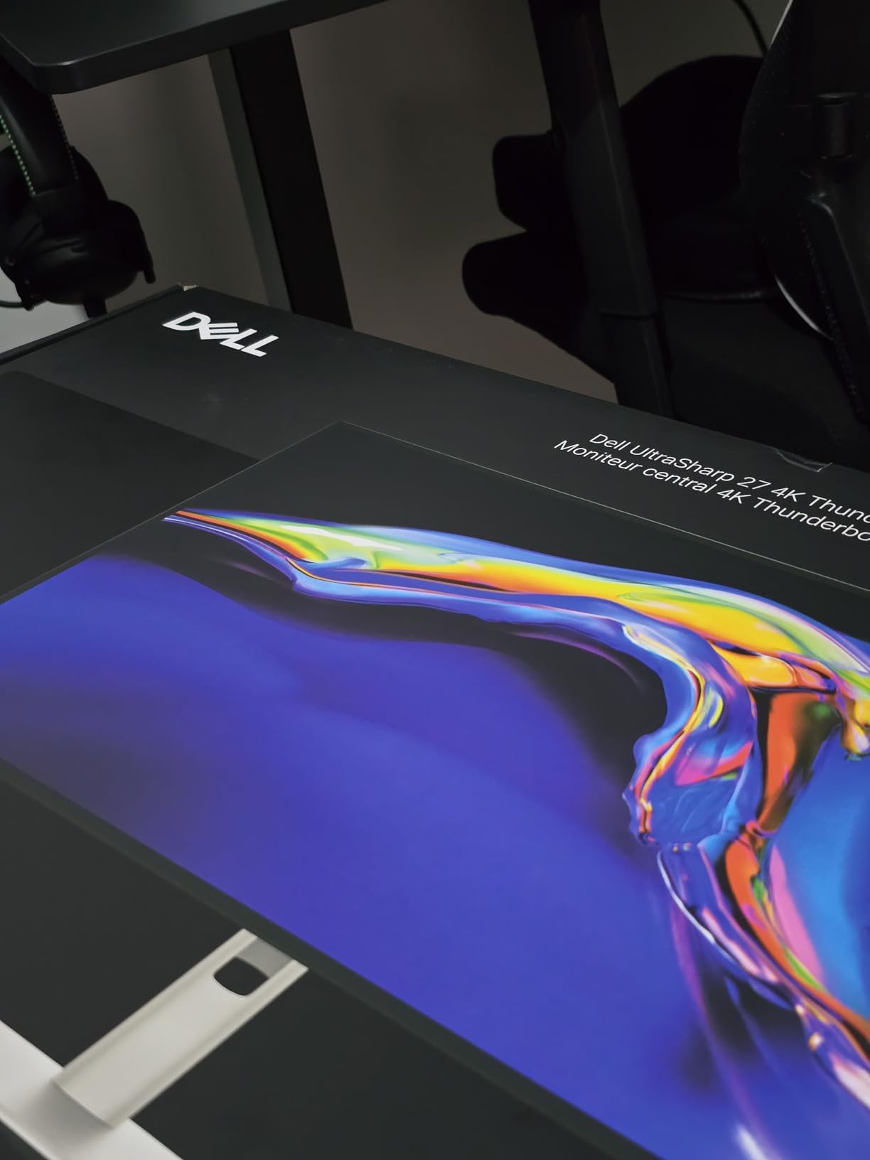
8. Dell UltraSharp U2725QE – Best for Color-Critical Document Work
Dell UltraSharp U2725QE 27-Inch 4K UHD IPS Black Monitor
27 inch 4K IPS Black, 450 cd
Delta E under 1.5 calibrated
Light sensor
Thunderbolt 4
+ Pros
- Factory calibrated text and color at Delta E under 1.5
- ComfortView Plus with built-in ambient light sensor
- 120Hz with 5ms keeps scrolling smooth
- Thunderbolt 4 docking with 140W power delivery
- Extensive port selection including Ethernet
– Cons
- Premium price point for the category
- Heavy external power supply brick
This is the monitor to buy when your documents contain images, charts or layout work as well as body text. The 4K UHD IPS Black panel ships with a factory calibration report and is calibrated to Delta E under 1.5 across 99% DCI-P3, so colors you see on screen match the source closely enough for photo and video review as well as for reading.
At 450 cd brightness it is the brightest panel in this roundup, which makes it the most capable in a genuinely daylit room. The ambient light sensor paired with ComfortView Plus means the panel adjusts its output as room light changes, which removes a whole category of end-of-day brightness discomfort without you touching the settings.
The Ambient Light Sensor Is the Underrated Feature
Most people set brightness once and live with it, then wonder why the screen feels harsh at night and dim in the morning. The built-in light sensor on this model closes that loop automatically, and ComfortView Plus handles the blue light side of the equation at the hardware level.
For someone who reads all day in a room where lighting changes constantly, this is the feature that produces the biggest comfort gain, and no competitor in this list has it. The 120Hz refresh and 5ms response also mean long documents scroll without the faint judder that 60Hz panels produce.
Thunderbolt 4 and a Real Port Budget
Thunderbolt 4 with up to 140W power delivery means a single cable carries display, data and laptop charging, with multi-monitor daisy chaining if you build a two-screen document setup. The port selection covers HDMI 2.1, USB-C, USB-A and Ethernet, which is as close to a complete dock as a monitor gets.
A factory calibration report is included in the box along with the cables, and the three-year Advanced Exchange Service and Premium Panel Exchange is the longest warranty among the office-oriented models here. The two complaints users raise are predictable: the price point is high, and the external power supply brick is heavy and bulky behind a desk.
Who Should Skip It
This is the most expensive monitor in the roundup, and if your reading is pure text with no color-critical work, you are paying for accuracy you will never check. In that case the Dell S2725QS at the top of this list gives you 4K text and a 120Hz panel for a fraction of the cost.
9. BenQ MA270U – Best for MacBook Document Work
BenQ MA270U 27” 4K 3840×2160 Monitor for MacBook® Pro/Air, Dual USB-C, 90W Power Delivery, Mac Color Match, USB Hub, Brightness & Volume Control on Mac, Height & Tilt Adjustable Stand, P3 Color Gamut
27 inch 4K IPS, 2000:1 contrast
Mac Color Match and P3
USB-C 90W
Blue light filter
+ Pros
- Sharp 4K text on a near-borderless panel
- Mac Color Match tuning with P3 wide color gamut
- One USB-C cable for display data and 90W charging
- Integrated Mac keyboard brightness and volume control
- Stand adjusts height tilt swivel and pivot
– Cons
- Display Pilot 2 software needed for most settings
- Single accessible USB-A port is awkward to reach
- 60Hz refresh rate only
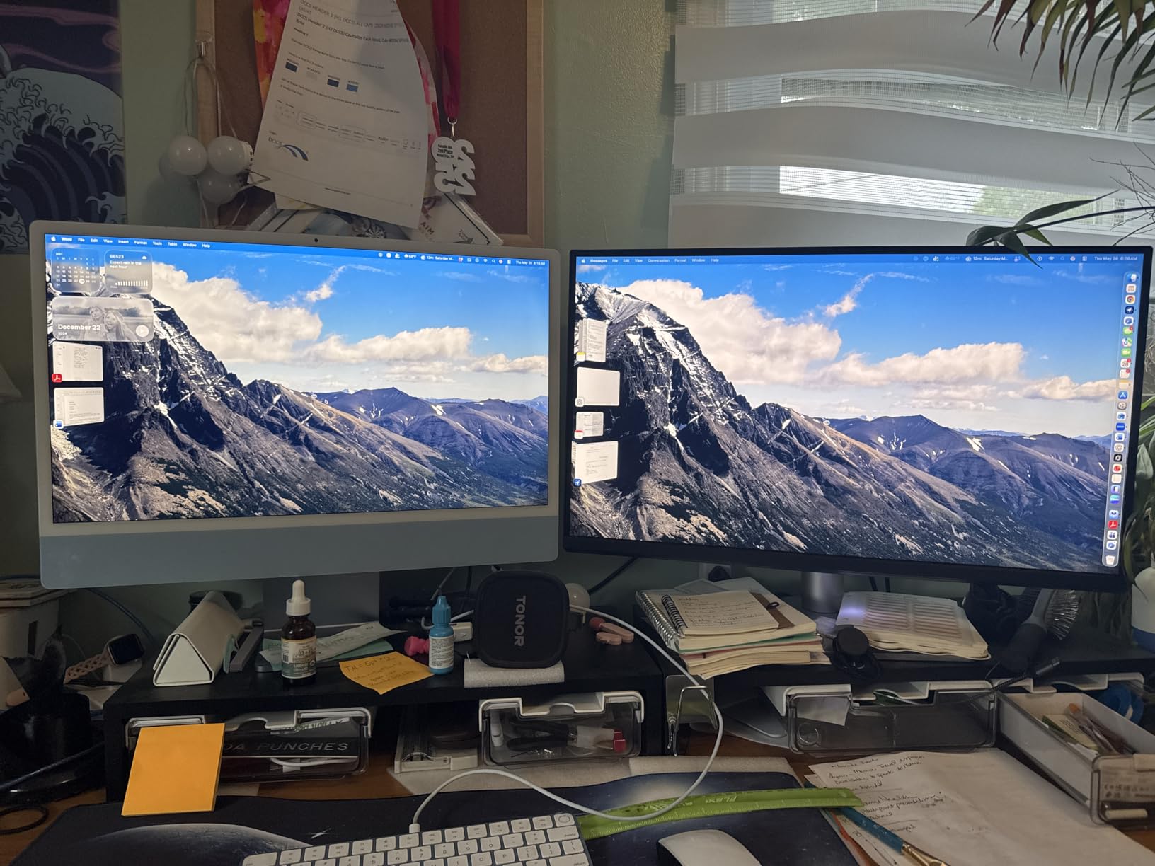
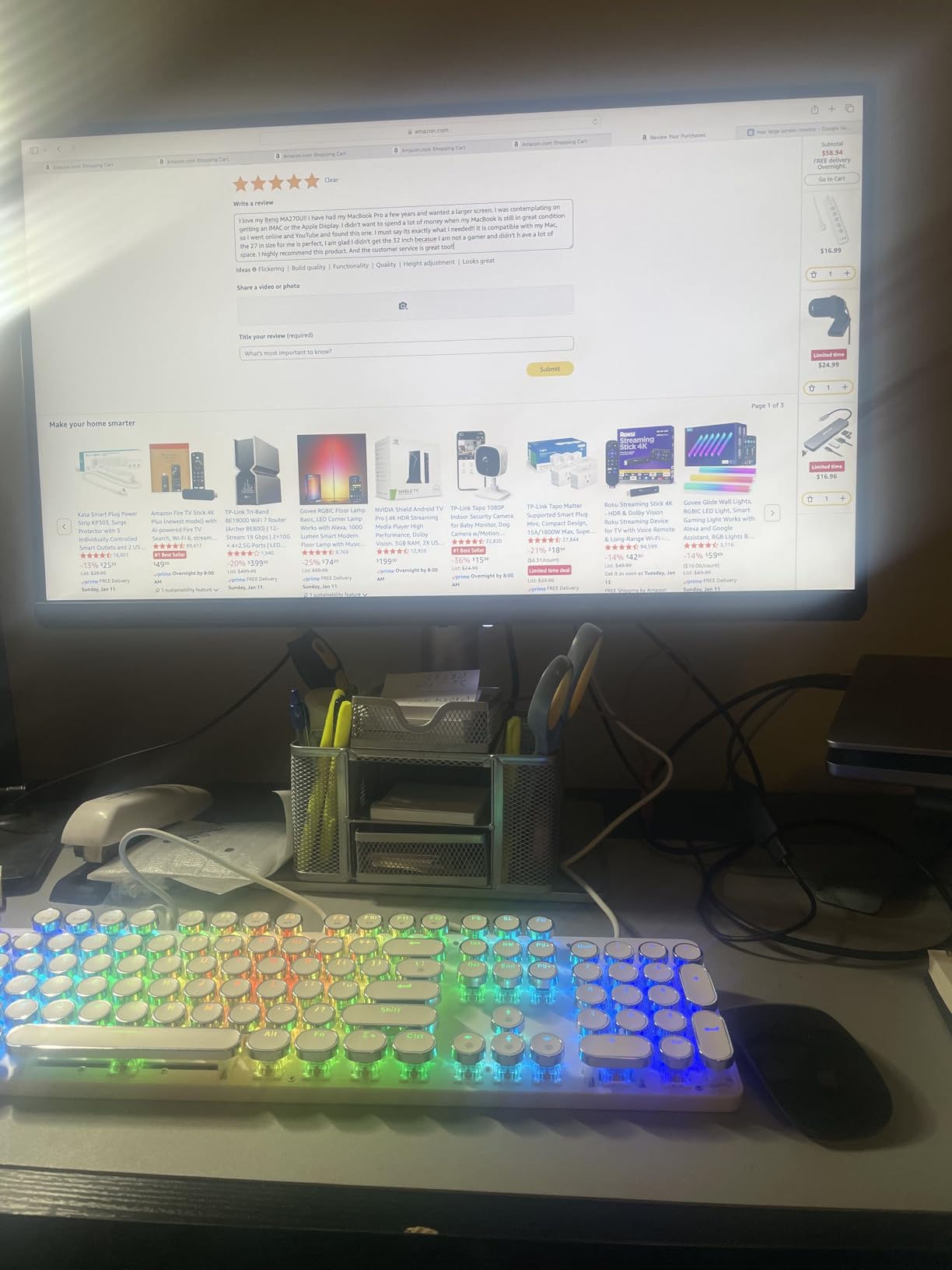
Mac owners who need a second screen for document work consistently rate this model above similarly priced alternatives, and at 4.5 stars across 213 reviews the sentiment is strong. Mac Color Match tuning and P3 wide color gamut mean a macOS display renders text and images the way the system expects, which removes a whole class of colour-management friction.
The single USB-C cable handles display, data and 90W charging, and there is a secondary 15W charging port for accessories. The panel itself is a 27-inch 4K IPS with 2000:1 contrast, so the text legibility case stands on its own regardless of the Mac-specific tuning.
Mac Integration That Actually Helps
BenQ has added built-in control of MacBook keyboard brightness and volume directly from the monitor, which sounds minor until you have used a multi-screen desk and know how annoying it is to reach for the keyboard to fix the speaker level. The Mac Color Match preset sits alongside the blue light filter and eye care features, so the reading settings are part of the same on-screen control scheme.
For a document-heavy workflow this is a two-screen setup done properly: close the laptop, connect one cable, and you have 4K text on a 27-inch IPS panel with a height, tilt, swivel and pivot adjustable stand. The near-borderless design keeps the visible area large relative to the bezel.
The Software Catch and Other Limits
The most common complaint is that Display Pilot 2 software is required for most settings and is not included in the box. If you like adjusting brightness, contrast and color temperature directly from an on-screen menu, that is friction you will feel daily. If you set the display once and leave it, it matters much less.
Two smaller issues: the single accessible USB-A port sits in an awkward position, and the refresh rate is 60Hz. Neither affects document reading, but both are worth knowing if you also expect to use the display for motion or for peripherals.
Who Should Skip It
Skip it if you are on Windows and want a self-contained monitor with no setup software, or if 60Hz will bother you. A three-year manufacturer warranty is included, which is longer than most of the LG and Samsung models in this roundup.
10. LG 32UP83AK – Best Desk for Side-by-Side Document Work
LG 32UP83AK-W 32-inch Ultrafine 4K UHD (3840 x 2160) IPS Computer Monitor, 60Hz, HDR10, Built-in Speaker, Reader Mode, HDMI, DisplayPort, USB Type-C 60W PD, Tilt/Height/Pivot Adjustable Stand, White
31.5 inch 4K IPS
Reader Mode
USB-C 60W power delivery
Height tilt and pivot stand
+ Pros
- Side-by-side room for multiple documents
- Reader Mode for long reading sessions
- USB-C with 60W power delivery over one cable
- Built-in stereo speakers
- Height tilt and pivot adjustable stand
– Cons
- Only 60Hz refresh rate
- 1000:1 contrast ratio is modest for an IPS panel
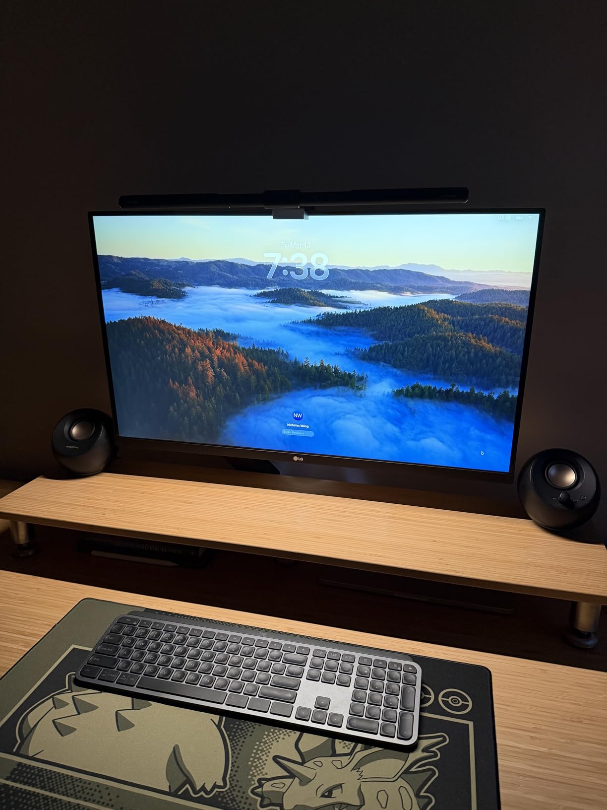
At 31.5 inches and 4K, this is the panel for people whose work involves comparing documents. Two A4 pages at a readable zoom level, or a PDF and a spreadsheet open at once, is a daily reality in legal, medical, finance and editorial work, and a 32-inch screen handles it without the constant alt-tabbing that a 24-inch display forces.
The user consensus is that this is a productivity display rather than a gaming one, and readers single out Reader Mode as the feature that makes long sessions manageable. Height, tilt and pivot adjustment is included, so you can raise it to eye level and rotate to portrait when a document is taller than it is wide.
31.5 Inches and Why It Is the Practical Maximum
Thirty-two inches at 4K is roughly 138 PPI, which is the sweet spot for text. Large enough that characters are physically bigger and you stop leaning in, dense enough that edges stay clean when you zoom. Beyond this size, you need more desk depth and a more deliberate viewing distance to keep the text at a comfortable angle.
Pair the size with a monitor arm and you also solve the desk-depth problem, because the arm lets you pull the panel closer when you want to read and push it back when you want two documents visible. The built-in speakers are a practical addition for a shared desk where audio comes through the display.
What the Spec Sheet Leaves Open
Contrast is listed at 1000:1, the standard IPS baseline, so blacks on a white page will not have the density of the MVA and VA panels elsewhere in this list. In practice the difference is subtle on a well-lit document, but it is the reason the ViewSonic and Samsung 32-inch models claim stronger contrast figures.
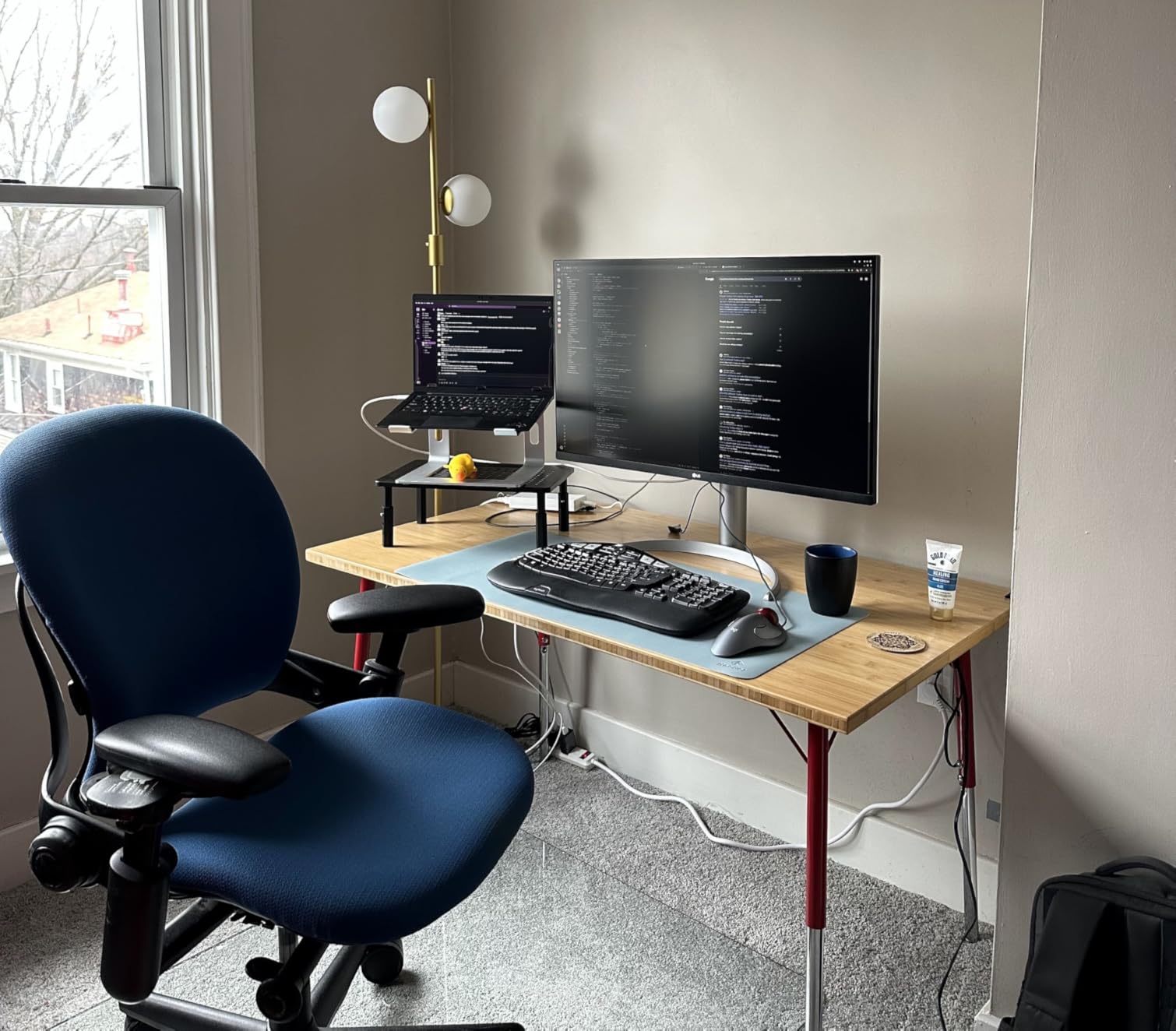
USB-C with 60W power delivery covers most laptops over a single cable, and the HDMI and DisplayPort inputs cover desktops. The refresh rate is 60Hz, which is entirely appropriate for a document desk and the reason several buyers describe this as a productivity-first display.
Who Should Skip It
Pass on this if contrast-sensitive photo work is part of your job, or if you need higher refresh rates. For text and documents it does the job well, and the height and pivot adjustment means it can double as a portrait screen for reviewing long pages.
11. ASUS VP327Q – Best for Certified Flicker-Free Eye Care
ASUS VP327Q 32 Inch 4K UHD Computer Monitor, HDMI, DisplayPort, Speakers
31.5 inch 4K, 3000:1 contrast
ASUS Eye Care TV-certified
99% sRGB
HDR-10
+ Pros
- 31.5 inch 4K panel gives sharp text and plenty of desktop space
- TV-certified flicker-free and low blue light filters
- HDR-10 support with 99% sRGB gamut
- Dual HDMI plus DisplayPort for easy multi-device switching
- Built-in stereo speakers and VESA mountability
– Cons
- Panel is VA rather than IPS as some listings claim
- Outdated DisplayPort 1.2 and HDMI 2.0 ports
- Finicky firmware and awkward OSD joystick
This is the only monitor here whose flicker-free claim is TV-certified, and if you are flicker-sensitive that distinction is not marketing filler. The ASUS Eye Care implementation covers both flicker-free backlight operation and a low blue light filter, which is the pairing that community recommendations consistently point to as the safest configuration for long sessions.
On size and resolution it matches the other 32-inch 4K options: 31.5 inches, 3840 by 2160, 3000:1 contrast and HDR-10 support with 99% sRGB coverage. Dual HDMI and DisplayPort make it easy to switch between a laptop and a desktop, and it is VESA mountable with built-in stereo speakers.
Reading the Panel Type Carefully
Here is the detail to check before buying: some listings describe this as IPS, but buyers consistently report a VA panel, and the weaker off-axis viewing angles and darker edges are consistent with that. For a centred reading position the difference is minor. For anyone who works at an angle to a large screen, it is not, and you should know in advance.
Brightness is listed in lumens rather than the cd per square metre figure used elsewhere in this roundup, so treat brightness comparisons against the other monitors as approximate. For a normally lit room it performs adequately; in a very bright space the IPS and 300 cd panels have more headroom.
Where the Four-Star Rating Comes From
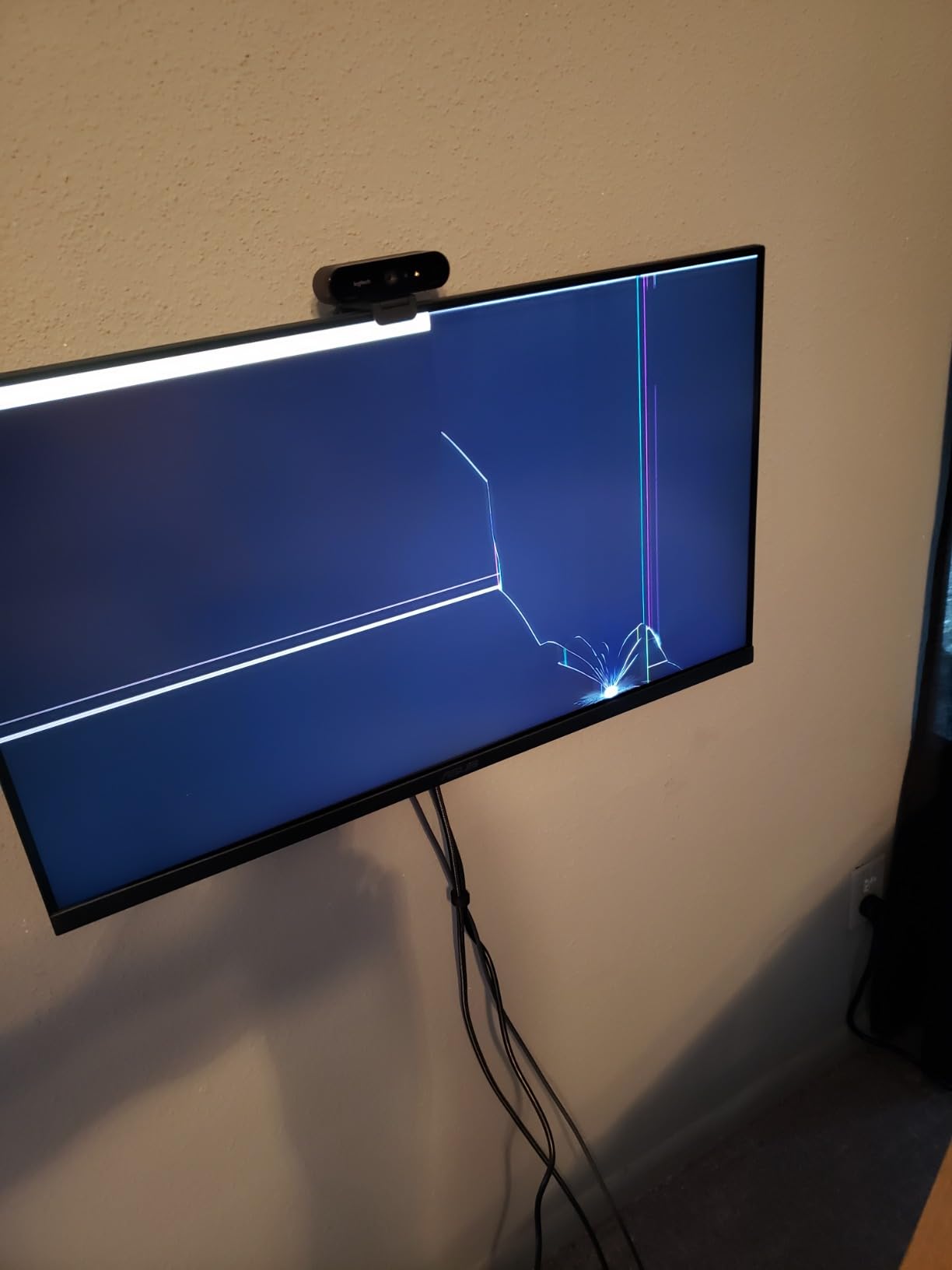
This is the lowest-rated pick in the group at 4.0 stars, with 60% five-star but 11% one-star. The complaints cluster around firmware behaviour, with HDMI input power-cycling and an awkward OSD joystick mentioned repeatedly, plus a steady stream of dead-pixel and transit-damage reports.
Ports are on the old side too, with DisplayPort 1.2 and HDMI 2.0 rather than current revisions. The three-year warranty with Advanced Replacement and Repair partly offsets the reliability concerns, and it is one of the longer warranty terms in this list.
Who Should Skip It
Skip it if off-axis viewing matters, if firmware stability is non-negotiable in your workflow, or if you want current-generation ports. If flicker-free operation is your single highest priority and you cannot verify certification on other models, this is the one to shortlist.
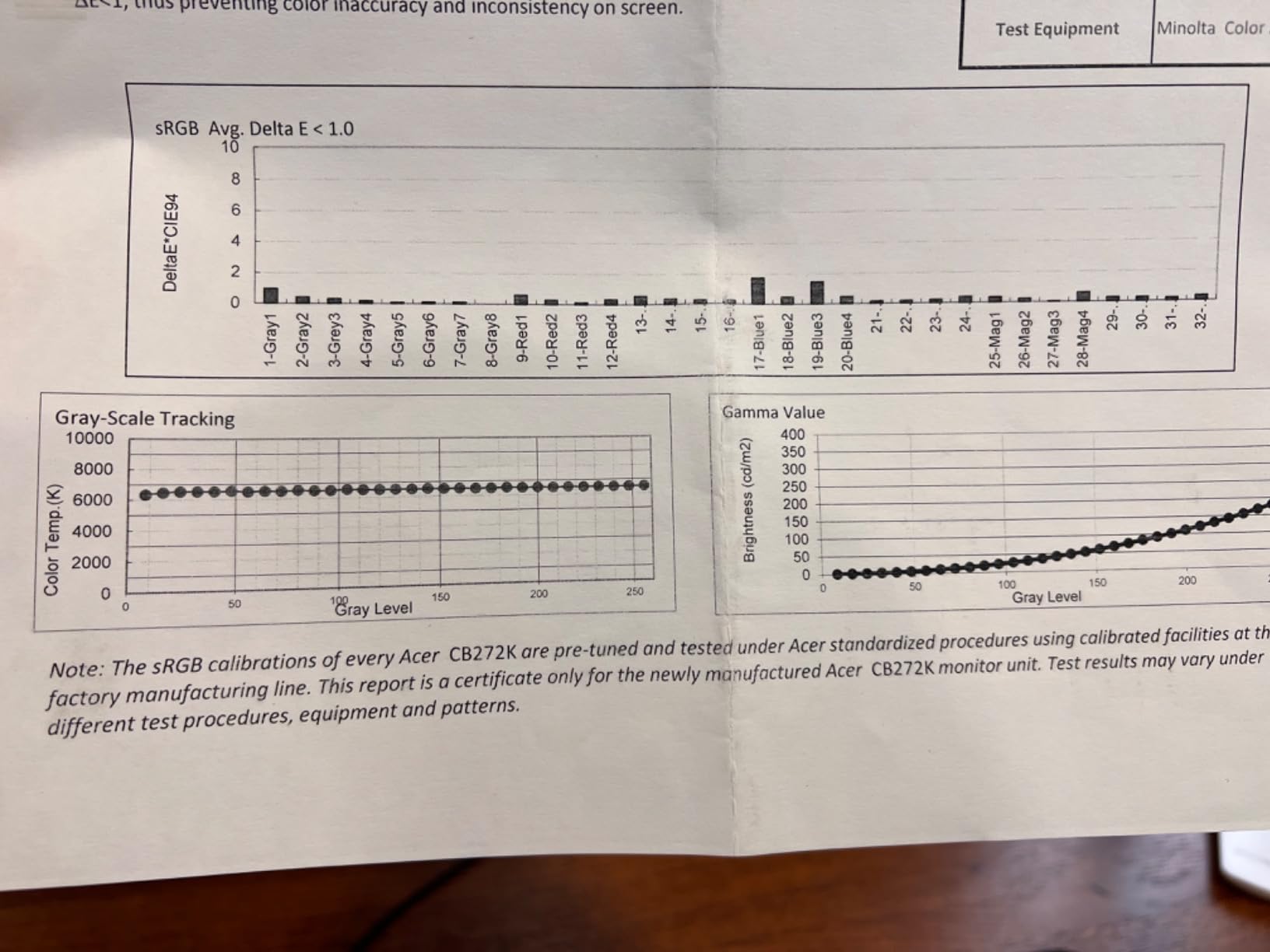
12. Acer CB272K bmiprux – Best for One-Cable USB-C Desks
Acer 27in 4K 3840×2160 IPS 60Hz Office Monitor CB272K bmiprux
27 inch 4K, 2000:1 contrast
Eyesafe Display
Zero-frame bezel
USB-C 90W dock
+ Pros
- Crisp well-calibrated 4K image
- Eyesafe Display filters blue light without shifting color
- Zero-frame bezel maximizes usable screen area
- USB-C 90W dock handles display data and charging on one cable
- 99% sRGB with 2000:1 contrast
– Cons
- Slow startup time compared with older Acer monitors
- Heavy 18.3-pound chassis
- Stand has only a single height position
This Acer combines a 27-inch 4K panel with a 2000:1 contrast ratio and a full USB-C dock at 90W, which is an unusual combination at this position in the range. The Eyesafe Display certification filters high-energy blue light without shifting color, and that distinction matters: plenty of low blue light modes also make the page look visibly warmer and duller than it should.
The zero-frame bezel maximizes usable screen area, so you get more page on screen without a larger physical panel. Office-oriented buyers praise the sharp image and accurate color, and several mention planning to buy a second one for a two-screen document setup.
Why Contrast Matters More Than Certification
For body text, contrast ratio is the property you feel without noticing. At 2000:1, black text on a white page keeps a consistent weight across a full 27-inch surface, and it holds up better than a 1000:1 panel when you lower brightness for evening reading rather than watching the text thin out.
The Eyesafe Display treatment is hardware-level and, per buyers, does not cost you color fidelity, which is why it pairs sensibly with the 99% sRGB coverage here. If you care about the appearance of images embedded in your documents as well as the text, that combination is the point of this monitor.
Reliability Is the Real Question
At 4.0 stars with 20% four-star and 13% one-star, this model has the widest spread of opinions in the roundup. The recurring negatives are a slow startup time compared with older Acer monitors, a heavy 18.3-pound chassis, and reports of examples arriving with misaligned buttons or with occasional USB-C sync drops.
The stand also has only a single height position, so plan on a monitor arm if you need to raise the panel. On the positive side, a three-year parts and labour warranty is included, which is a meaningful mitigation for a display that some buyers have had to replace.
Who Should Skip It
Pass if you want a light, fast-starting monitor or a stand with real height adjustment. The USB-C dock, 2000:1 contrast and color-preserving blue light filter are genuinely appealing for a laptop-first desk, provided you are comfortable checking your example carefully on arrival.
Panel Type for Text: IPS vs VA vs TN vs OLED vs E-Ink
An IPS panel is the best default choice for reading documents. It delivers accurate color, wide viewing angles and consistent brightness across the screen, which keeps text weight even from corner to corner. VA panels offer deeper blacks and higher native contrast, which is a genuine advantage for white pages, but they shift visibly off-axis. TN panels are the cheapest and the worst choice: narrow viewing angles and poor color make small text blur and shift in a way that is hard to unsee once you have noticed it.
For the direct answer to the OLED question: IPS is better for text than OLED, and the reason is dimming. Most OLED panels use pulse-width modulation to control brightness, and at lower brightness settings the pulse rate drops. Flicker-sensitive users report headaches and eye fatigue from this, and the mitigation many find is dropping brightness on a large OLED or switching panel type entirely. The forums are full of people who moved from OLED to IPS and still strained until they also reduced brightness and warmed the color temperature, which is why panel type alone is not the whole answer.
E-Ink and reflective LCD monitors exist and remain genuinely interesting. There is no backlight at all, so there is no flicker, no blue light and no glare from ambient light, and reading on one feels like reading paper. The limitation is output: monochrome, slow refresh, and a price that puts them far above the office monitors here. They remain a specialist choice for migraine and light-sensitive users rather than a general recommendation, and none of the twelve monitors in this roundup use e-paper.
Size, Resolution and the PPI Math for Body Text
Pixel density is the number that predicts text quality, and the reference points are worth memorising. A 24-inch 1080p panel sits at roughly 92 PPI. A 24-inch 1440p panel reaches about 123 PPI. A 27-inch 1440p panel lands near 109 PPI. A 27-inch 4K panel is roughly 163 PPI. A 32-inch 4K panel comes in around 138 PPI, and a 34-inch ultrawide at 3440 by 1440 is about 109 PPI.
Below roughly 100 PPI you will start to see jagged edges on small text, and above 140 PPI letterforms look properly typeset. That is why every monitor in this roundup is a 4K panel, and why a 32-inch 4K screen is a legitimate alternative to a 27-inch 4K rather than a compromise.
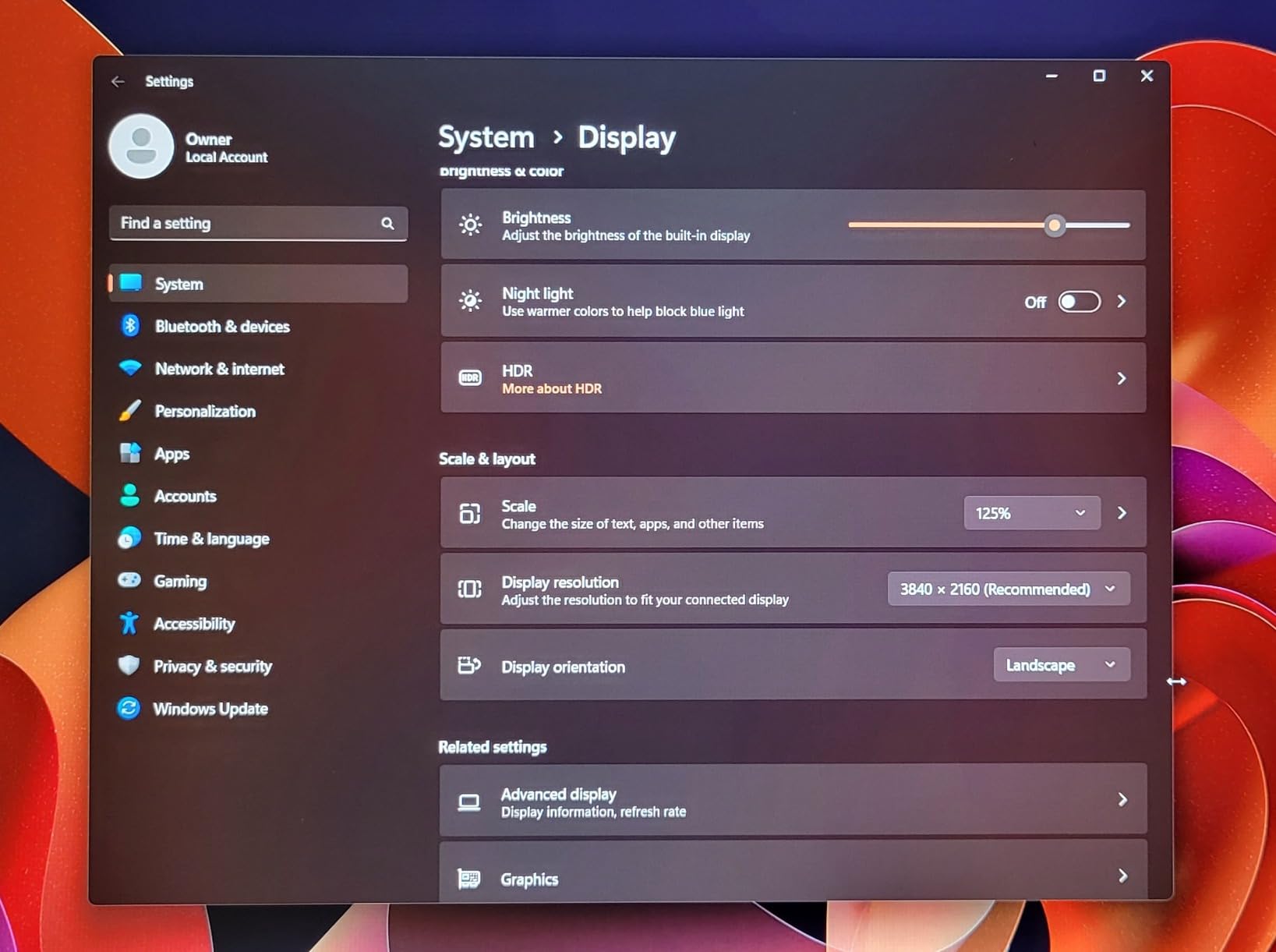
Operating system scaling is where most people get caught out. A 27-inch 4K panel at 100% scaling gives small text, and some users describe it as fuzzy. At 150% scaling the same panel is comfortable. A 32-inch 4K panel is usually run at 150% as well, and 125% makes characters noticeably larger. Set the scaling to match your eyesight rather than the other way around, and remember that text rendering quality improves sharply above 130%.
For the 27 versus 32 question: 27 inches suits a desk you sit close to, 32 inches suits a deeper desk and side-by-side work. Both are correct answers. A 32-inch panel lets you keep more text on screen at once and encourages sitting further back, which reduces the leaning-in posture that causes reading discomfort. A 27-inch panel puts more text under your eyes with less neck movement, which suits people who already sit upright and close.
Eye Comfort Features Worth Paying For
Flicker-free means the backlight does not pulse as it dims. Look for the phrase on the spec sheet rather than a vague eye care mode label, and treat TV-certified flicker-free claims as stronger evidence than marketing language. DC dimming, where brightness reduction holds a steady voltage, is the variant that holds up across the entire brightness range rather than only at maximum output.
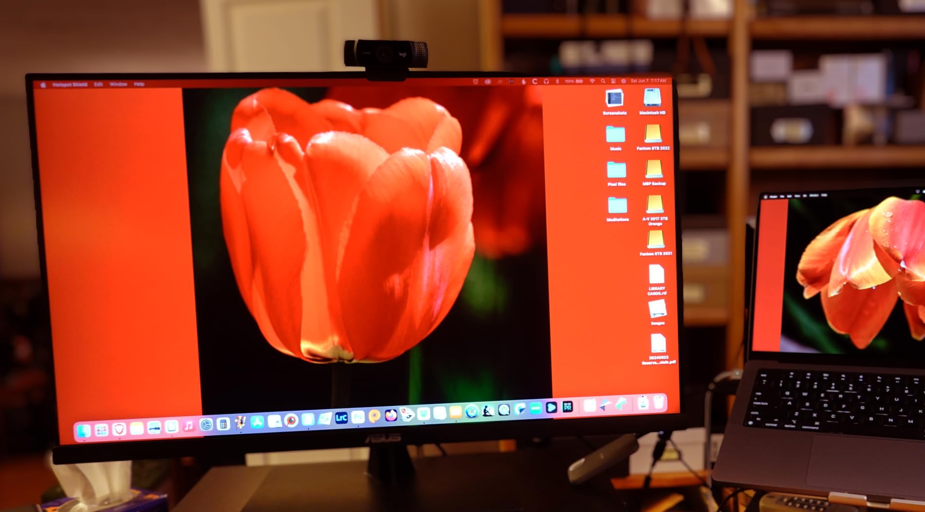
Blue light filters come in two forms. A software filter shifts the display warm through the operating system and is free, and it also shifts everything else including photographs. A hardware filter reduces blue light emission at the panel level, which is what the Eye Care and ComfortView implementations in this roundup do. Hardware is the better buy for reading, and a panel that ships with a warm default color temperature saves you from adjusting anything at all.
Matte or anti-glare coating is the most underrated feature on this list. A glossy panel reflects your window, your ceiling light and your own face, and you end up fighting the reflection instead of reading. Every monitor here has a matte finish, and on a 32-inch panel it makes an obvious difference.
When you compare certifications, treat TUV Rheinland Eyesafe and SGS Eye Care marks as evidence of a measured blue light reduction, and treat flicker-free specifications as the baseline you should not compromise on. Neither replaces the environment around the screen, which is where the next section starts.
Ergonomics, Portrait Mode and Desk Setup
Distance matters as much as panel type. Sit roughly an arm’s length from a screen, somewhere between 20 and 30 inches, with the top of the panel at or just below eye level so you look slightly downward. A 32-inch screen at that distance shows a comfortable amount of a document page without requiring you to move your head to read across it.
Height adjustment is the feature that prevents neck tension from being mistaken for eye strain. Four of the twelve monitors here offer height, swivel and pivot adjustment. For the ones that do not, a VESA monitor arm fixes the problem, and all of these panels support a standard mount. Pivot to portrait is genuinely useful for long documents and narrow columns of text, because it lets you use a tall page at a comfortable character size instead of scrolling constantly.
Lighting around the screen does more for reading comfort than most hardware features. A bias light behind the monitor reduces the contrast between a bright display and a dark room, which is what causes the tired, dry feeling at the end of a long session. If you need one, our guide to the best LED desk lamps for reading covers bias lighting and task lighting together. If your reading happens away from a desk entirely, the best accent chairs for reading nooks roundup covers the seating side of long sessions.
Set color temperature warmer in the evening and match screen brightness to a sheet of white paper held next to the display. Then follow the 20-20-20 rule: every 20 minutes, look at something 20 feet away for 20 seconds. Blink deliberately while you do it. Screen reading cuts blink rate dramatically, and dry eyes are one of the most reliable symptoms of digital eye strain.
Frequently Asked Questions
What type of monitor is best for reading text?
An IPS panel with high pixel density, strong native contrast, a flicker-free backlight and a matte anti-glare coating is the best all-round choice for reading text. IPS gives accurate color and wide viewing angles so text weight stays even across the screen. For pure paper-like comfort with no backlight at all, an E-Ink or reflective LCD display is the specialist option, but it is monochrome and much more expensive.
Which monitor is best for reading documents overall?
The Dell S2725QS is the strongest all-round pick because it combines a 27-inch 4K IPS panel with 1500:1 native contrast, a 120Hz refresh rate for smooth scrolling, hardware ComfortView Plus blue light reduction and a stand that adjusts for height, tilt, swivel and pivot. The KTC 27-inch 4K IPS is the value alternative at 4.3 stars across more than 2000 reviews.
Is a 27 or 32 monitor better for office work?
A 27-inch 4K panel is better if you sit close to the screen and want more text under your eyes with less head movement. A 32-inch 4K panel is better if you want two documents open side by side, prefer a larger physical text size, or tend to lean in when reading. Both run at roughly 130 to 163 pixels per inch, so text sharpness is similar at 150% display scaling. Choose by desk depth and workload rather than by clarity.
Is OLED or IPS better for text?
IPS is better for long text-heavy sessions. Most OLED monitors dim brightness using pulse-width modulation, and the pulse rate drops at lower brightness settings, which flicker-sensitive readers report as headaches and eye fatigue. OLED panels do deliver perfect blacks and very high contrast, so if you need image accuracy and do not notice flicker, OLED is a reasonable choice. For documents, a flicker-free IPS or VA panel with a hardware blue light filter is the safer recommendation.
Do blue light filters help with eye strain?
They help, but they are one factor among several. Hardware low blue light filters reduce blue-rich light in the evening, which many readers associate with tiredness and disrupted sleep. The larger contributors to digital eye strain are backlight flicker, a screen much brighter than the surrounding room, glare from reflections, and holding a viewing posture that requires leaning in. Match brightness to the room, use a matte coating, sit an arm’s length away and take 20-second breaks every 20 minutes.
Which Reading Monitor Should You Buy?
If you want one monitor that handles documents, spreadsheets and general work without compromise, take the Dell S2725QS. It is our Editor’s Choice for 4K text clarity, 1500:1 contrast, a 120Hz panel and a stand that reaches eye height.
If budget matters most, the KTC 27-inch 4K IPS delivers the same resolution and a matte, anti-blue-light panel across more than 2000 reviews. If your documents are dense or full of fine print, the KTC 5K2K gives you the sharpest text available here. For two documents open at once, the ViewSonic VX3276 or the LG 32UP83AK both do the job, and the ViewSonic adds a dedicated Text preset.
For evening reading, the LG 27UP650K ships with a warm default color temperature plus Reader Mode and Flicker Safe. For MacBook users, the BenQ MA270U handles display, charging and color in one cable. For color-critical work, the Dell UltraSharp U2725QE is factory calibrated to Delta E under 1.5.
Whichever you pick, set the display scaling so body text feels comfortable, match brightness to a sheet of paper, and give your eyes a break every 20 minutes. A good monitor solves most of the problem, and those three habits solve the rest.
Leave a Reply